Lake Wānaka Tourism’s new logo unveiled
Harri Jordan
16 July 2021, 8:11 PM

Lake Wānaka Tourism (LWT) has unveiled new branding that reflects Wanaka “as a people and a place”.
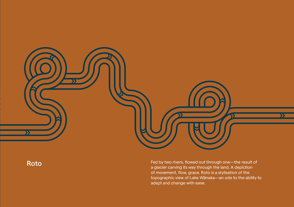
The new branding, the third in 11 years, features rusty and earthy tones and uses a stylised ridge of the Skyline Track to Roy’s Peak and on to Coromandel Peak.
“The brand is a deep dive, not just a logo,” LWT marketing and communications manager Gizelle Regan said.
LWT was recently funded $700,000 by the Ministry of Business, Innovation and Employment to tackle destination management, industry capability and destination marketing. Gizelle said a breakdown of the branding costs were “not yet able to be made available”.
Lake Wānaka Tourism general manager Tim Barke told participants at a LWT open day yesterday (Wednesday June 30) that the government closure of the borders in response to Covid-19 affected Wanaka’s visitor economy, “but has given us time to reflect on how we do things”.

Multiple lines in multiple directions indicate people’s historic and modern journeys.
“Our branding isn’t just a colour and a logo that looks nice, but it defines who we are as a people and a place,” he said.
Tim said while the logo will mean different things to different people, his own interpretation was that “the multiple lines in multiple directions indicate the historic and modern journeys of people from multiple backgrounds converging and moving together in a similar direction.”
“The notches indicate direction of time, direction of natural resources such as ice flows and rivers and how they connect with the lakes and the direction the people travel to follow the pathways that people have gone through to get here now.”
He said the new branding has a critical role to play in the invitation Wanaka wants to extend to its visitors, the experience it creates as a host community and how it preserves and nurtures its taonga.

The previous logo, developed in 2016, cost $15,000.
Brand strategist and facilitator Kate Smith, who attended the talk via video link, said the primary role of the brand was about “shifting from being about ‘attracting visitors’ to being about ‘how does a brand represent the true essence of Wanaka in a way that reflects community values and aspirations’.”
“The aspiration was to shift from being a sustainable tourism sector to a regenerative visitor economy,” she said.
LWT has joined Destination Queenstown and Queenstown Lakes District Council to develop a roadmap for tourism which enables viable and regenerative tourism by 2030.
Read more: New model of tourism under development
Tim said community feedback had been crucial to the creation of the new brand.
“We’ve gone out to the community and to industry leaders, different industry groups and community groups and said ‘what is it that you want the future of Wanaka to look like?’”

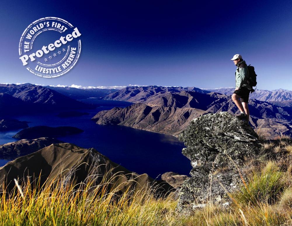
The 2010 logo, branding Wanaka the world’s “first protected lifestyle reserve”.
An open day attendee raised concerns about brand confusion, noting the logo’s similarity to that of Christchurch’s metro bus logo.
Graphic designer and Studio Acht owner Britt Davies (Te Arawa, Te Ati Awa, Ngā Puhi), who designed the branding, said “nothing is original” from a high-level branding perspective, but the brand must be “authentic and genuine to the story you're trying to tell”.
A preview of LWT’s new website was also unveiled at the open day, along with the organisation’s annual plan.
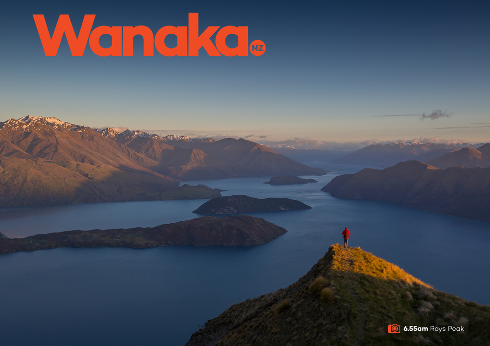
Lake Wānaka Tourism last unveiled a new logo and brand in 2016, which followed a review process that took six months and cost $15,000. The logo was ‘Wanaka NZ’, with the word ‘Wanaka’ followed by an orange subscript circle with ‘NZ’ at its centre.
That logo replaced the “world’s first protected lifestyle reserve” catchphrase, which was rolled out as part of a 2010 LWT rebrand. The ‘lifestyle reserve’ logo, which cost less than $20,000, attracted some criticism for its suggestion of exclusivity and its perceived connection to the retirement industry.
PHOTOS: Lake Wānaka Tourism


